Reflections from a Section 508 Certified Trusted Tester

I see content very differently now.
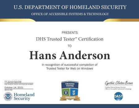
And it’s because I took the Department of Homeland Security’s Trusted Tester Certification. The purpose of a Trusted Tester Certification is to learn how to test a website for Section 508 compliance. Section 508 is a federal law which mandates that all electronic communication be accessible to people with disabilities. The standards for Section 508 are based on WCAG standards set by the World Wide Web (W3) consortium.
Having a 508 compliant website really comes down to just 4 qualifications: the site must be perceivable, operable, understandable, and robust. These are important for a user whether they have a disability or not. In fact, a website's accessibility is more important than the message it conveys. This is because that message can be obscured if the medium it comes through isn't operable or understandable.
Just yesterday, I was speaking to a colleague who was attempting to fill out a form on a website. When this colleague tried to submit that form, an error message appeared with only the message "fix the error before submitting." A Section 508 compliant website would direct the user to where the error is and explain what type of formatting issue occurred. This site didn't. So, instead of taking a minute to correct a form field error, it took 10. Most people will not stick around for 10 minutes trying to fish around for where an error in a form is.
This is just one example of an inaccessible website. There are many, many more ways that a website can deter users and obscure content.
Here are a few lessons I learned from the Section 508 Trusted Tester Program that can help you connect better with your audience:
People access and use websites and electronic communication in many different ways, make it easy for them to do this
Assistive technology like screen readers and speech to text are not the only way to think about someone with a disability accessing your website. Providing options to increase contrast and enlarge text are also important, just look at what the most recent iteration of whitehouse.gov to get a look at these options. Having accessible content is not just about what you have, but what you don’t. Autoscrolling text and autoplaying videos and audio can be distracting and disorienting, avoid these unless you really need to have it. When adding a new feature to your website, think about how people access and use your website. Is this new feature accessible or do you need to provide alternate options? The ultimate goal of your website should be for people find content and stay on your site. Accessibility is critical to this.
Perceivable, operable, understandable, and robust websites are beneficial, no matter how someone accesses a website
An easy to operate website is just good practice. Content that appears in a similar and expected order helps everyone navigate a site. Using proper markup and alt text for images is good for SEO and, subsequently, helps people find your site. Having clear directions on how to operate a website and logically ordered form fields provides a more pleasant user experience. Making your site accessible helps everyone navigate your site.
Pay attention to images
Pictures are one of the more common areas that can cause a website to be inaccessible. For example, a user usually can’t enlarge text that is in a picture. So, if that text isn’t in the alt text of a graphic, the text cannot be read by that user. If a picture is classified incorrectly, it can waste a user's time or critical information may be unreadable by accessible technology. Mark up your images properly.
Classifying the elements of a site correctly is critical
Having an incorrect markup for a table or a frame might go unnoticed when looking at a website, but for others it can make navigating a website very difficult. Marking up a decorative table as a data table can confuse users. And classifying content correctly isn’t just about the user, it’s about the site owner and developers. Everyone maintaining the site should be on the same page and in agreement that an element is what it is. It helps with internal communication and with accessibility.
Taking the Section 508 Trusted Tester course
The Trusted Tester process is rigorous and takes a long time to complete, but it should. I spent probably 60 hours and change getting this certification. It takes a long time to go through examples and understand how to use testing tools. It can be a frustrating and arduous process. But, that’s because there’s a lot of different ways that content can be inaccessible and it’s important to learn the correct processes for finding where accessibility issues occur. In short, this stuff takes time and practice to get down pat. If you have the time and are working on websites, I’d recommend the certification so you know where common pitfalls are and how to avoid them.
Learning about Section 508 and the ways sites can be inaccessible has opened up whole new way to see content. Sometimes, I’ll open up the ANDI tool to just see if a website is accessible. And I'm often surprised at how sites have failures that keep content from being accessible.


